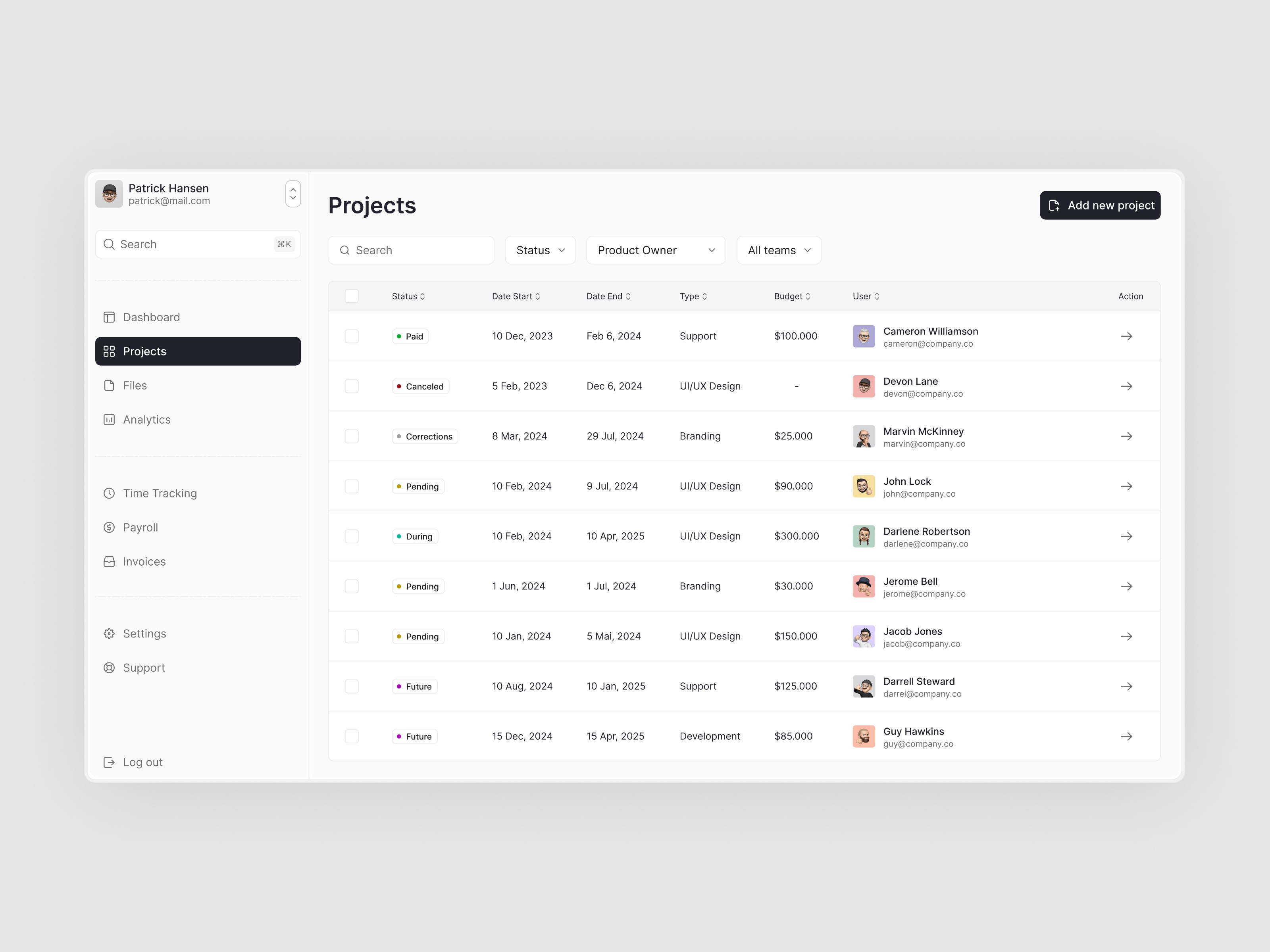
Dashboard - Project Managment
This project involves designing an intuitive project management dashboard tailored to enhance productivity and collaboration within teams. The focus is on creating a visually appealing and functional interface that simplifies task management, time tracking, and communication.
Client
Year
About Apresiasi Dari Kita App
Apresiasi Dari Kita or we usually called ADK is an internal app from WINGS group that allows employees to easily send and receive kudos, highlighting achievements, contributions, and positive behaviors.
The Challenge
The challenge was to design a user-friendly and motivating rewards feature that would encourage active participation, and enhance overall employee satisfaction and engagement.
The Objective
Create a Reward feature in ADK app, where users can claim rewards based on the points they earn from giving and receiving appreciation.
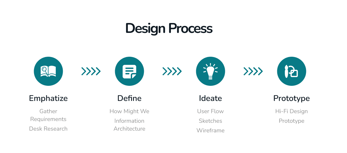
🔍 Emphatize
Gather Requirement
Conduct Initial Meeting
This ensured that all stakeholders were aligned on the expectations and deadlines, providing a solid foundation for the project.
Define High-Level Flow Process for Both ADK App and Portal
This high-level flow process mapped out how users would interact with the platform, ensuring a cohesive and intuitive experience across both interfaces.
Detail Specific Functionalities Needed for the Reward Feature
We focused on identifying and detailing the core functionalities required for the reward feature. This included aspects like how users would earn, track, and redeem rewards, as well as how recognition could be given and received.
Desk Research
To ensure we were developing a competitive and user-friendly platform, I conducted a benchmark analysis form competitor which have a reward feature in app such as MyTelkomsel, TIX ID, and tiket .com
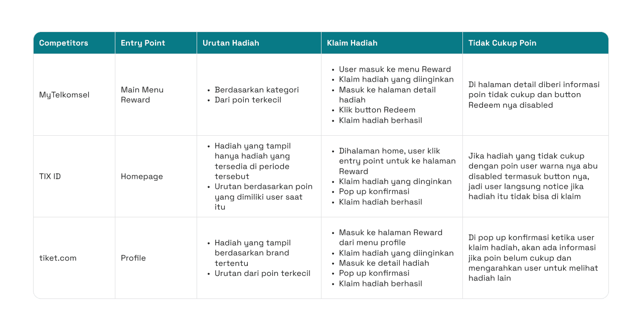
By examining these competitors, I gained valuable insights into how they structured their reward features, particularly in terms of user engagement, ease of navigation, and overall user experience.
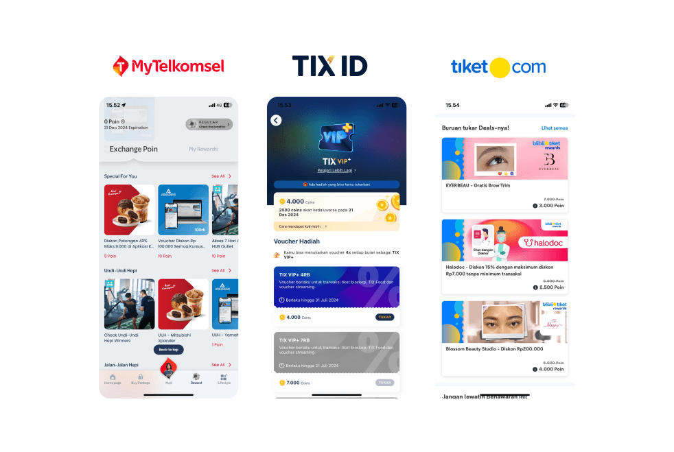
The analysis covered various aspects, including the entry points to rewards, the ordering of available rewards, the process of claiming rewards, and how insufficient points are communicated to users.
💡
Drawing from TIX ID's approach when user points are insufficient to claim a reward, I plan to implement a pop-up in ADK that informs users when they don't have enough points to claim a reward. This pop-up will include a button that encourages users to give more appreciation to earn additional points, motivating ongoing engagement.
📝 Define
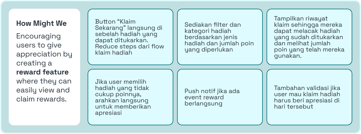
How Might We
To encourage users to give more appreciation, we creating a How Might We which reward feature that allows them to easily view and claim rewards. This will include a "Claim Now" button directly beside redeemable rewards to streamline the claiming process, filters for sorting rewards by type and required points, and a history view for tracking redeemed rewards and used points. If a user selects a reward without sufficient points, they will be directed to give appreciation to earn more. Additionally, push notifications will be sent for reward events, and users will need to give appreciation on the day they wish to claim a reward as an added validation step.
Information Architecture
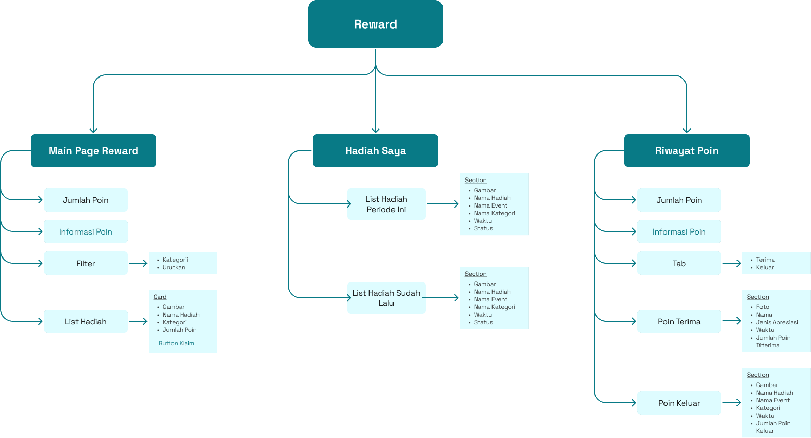
This Information Architecture for the reward system is structured into three main sections: the Main Page Reward, Hadiah Saya (My Rewards), and Riwayat Poin (Point History). The Main Page Reward includes features like point balance display, point information, filters, and a list of rewards with a "Claim" button. Hadiah Saya provides users with an organized list of their current and past rewards, detailing each reward's name, event, category, and status. Lastly, the Riwayat Poin tracks point activity, showing points earned and spent, along with relevant details such as event names, categories, and timestamps. This structure ensures users can easily navigate, manage, and track their rewards and point activities efficiently.
✏️ Ideate
User Flow, Sketches, Wireframe
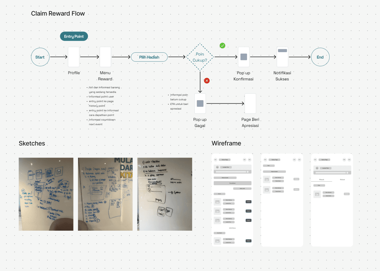
In the ideate phase, I developed the user flow to outline key interactions, created sketches to explore initial design concepts, and built wireframes to establish the structure and layout of the reward system. These steps were crucial in shaping the overall user experience and ensuring a clear, intuitive path for users.
📱 Prototype
Designing the UI
In the Prototype stage, I translated the wireframes into high-fidelity UI designs, focusing on visual details, branding, and usability. This step involved refining the interface to create a polished, user-friendly experience that aligns with the overall design vision.
Before we jump into the UI, there are a few important points to note about this feature:
Items are categorized into two groups: merchandise and non-merchandise.
In a single event, users can claim a maximum of 2 items, with one item allowed per category.
Users must give appreciation on the same day before they can claim a reward.
Entry Point
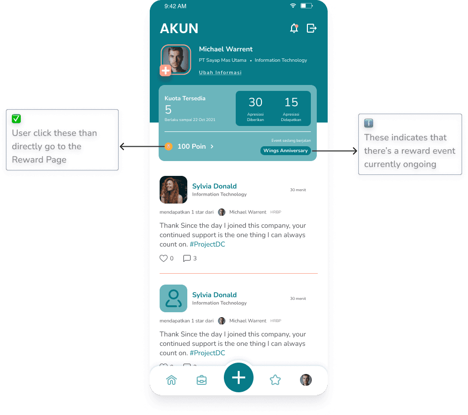
I placed the entry point for the reward feature in the profile section because stakeholders wanted to avoid overemphasizing this feature. Their primary goal is to ensure that the app's main function which giving appreciation remains the focus, rather than shifting attention to reward redemption.
Claim Reward
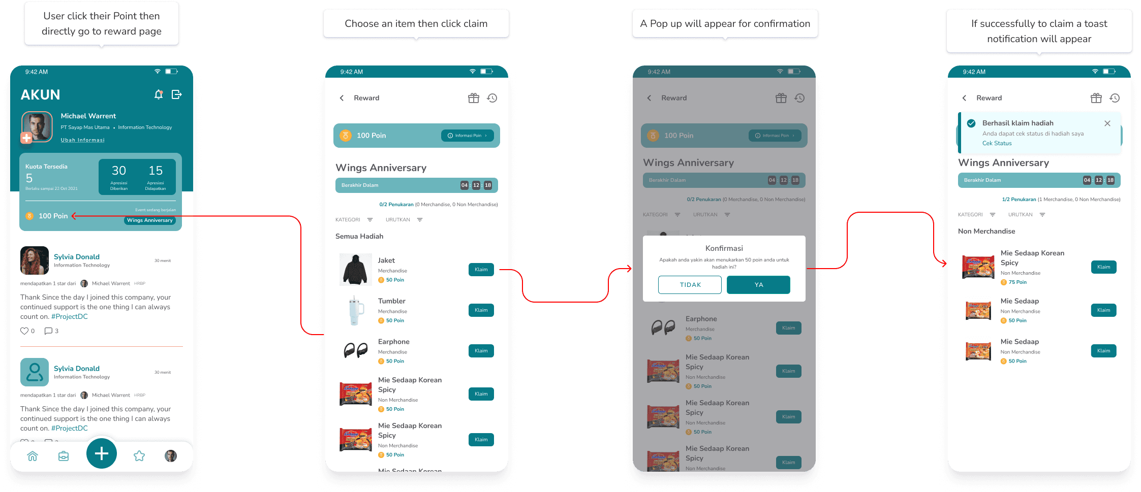
See more screen for details
🔑 Key Takeways
So many learning on this project. Especially how to effectively presenting design concepts and decisions to stakeholders. This crucial for the project's success and alignment with business goals.
💡Reflections
Effective Communication
Technical Feasibilty & Constraints
Effective manage a project