SIRCLO Webstore Template
This project was given when I was doing my internship at SIRCLO. I collaborate with the other designers, product manager, and engineers to crafting a features for E-Commerce web templates, and webstore settings. I have done several projects and will summarize some of my projects here.
Company
Year
Overview
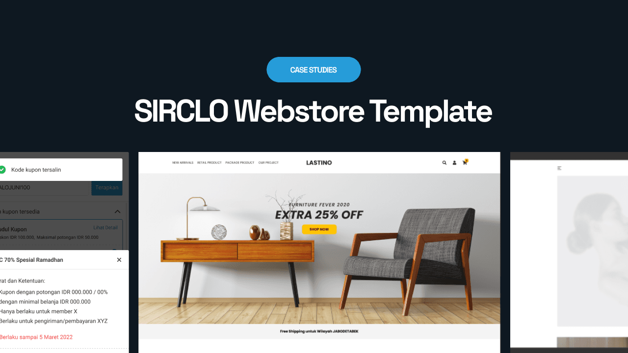
SIRCLO Store is one of the SIRCLO product to manage sales efficiently through the SIRCLO Store admin panel dashboard. It also provides online store website templates or e-commerce website templates. The templates provided have categories and designs for their respective product specifications.
I mostly work on some features that have to be changed based on the merchant's pain points found by the product manager or user support. Here I summarize some of my projects.
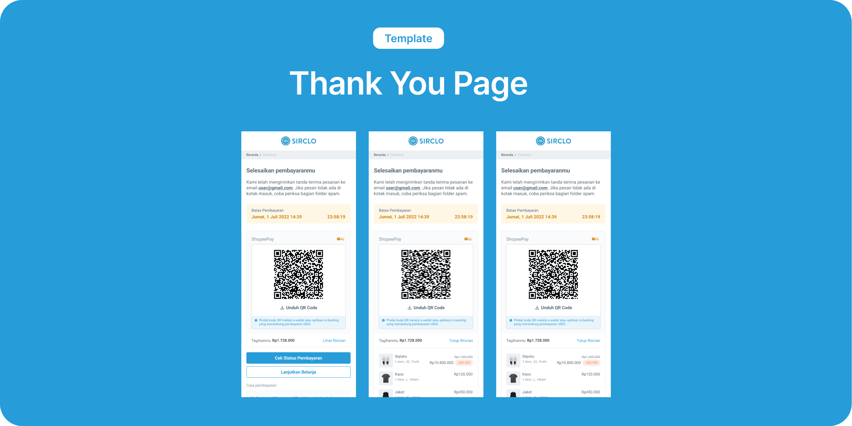
Thank You Page
Background
Currently, when a merchant activates SIRCLO Payment and a buyer uses that payment method, when it's finished, the buyer will be directed to the Thank You page. Unfortunately, this thank you page, which incidentally is arguably the last step of the buyer's shopping process, is on the SIRCLO Payment page with a different domain from the merchant's shop domain. This makes merchants unable to track whether the ads don't know whether it continues to be clicked by the visitor, and the visitor checkouts or not checkouts) because they can't be detected.
Requirements
Helping merchants to be able to track customers from entering the payment method selection to completing checkout due to different links
Displays the Thank you page according to the payment method chosen by the buyer
Displays the How to pay content that appears on the thank you page, according to the payment method selected
Parts of Thank You Page
The thankyou page is divided based on the selected payment method:
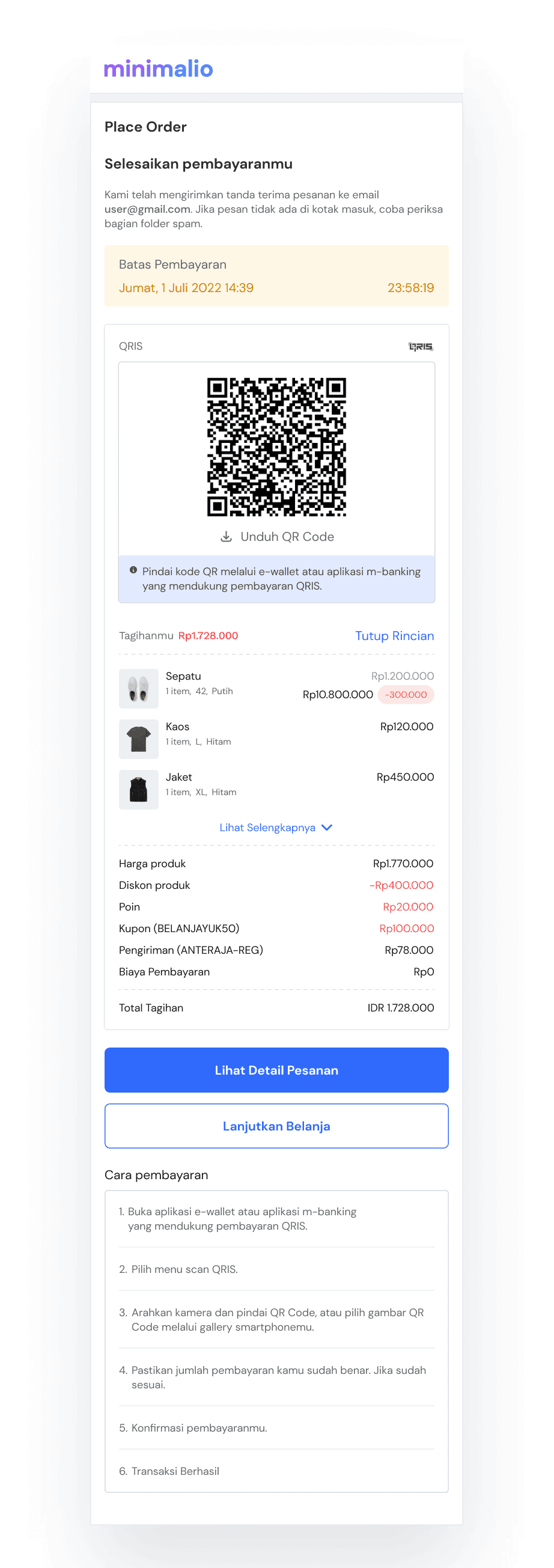
QRIS
User Stories
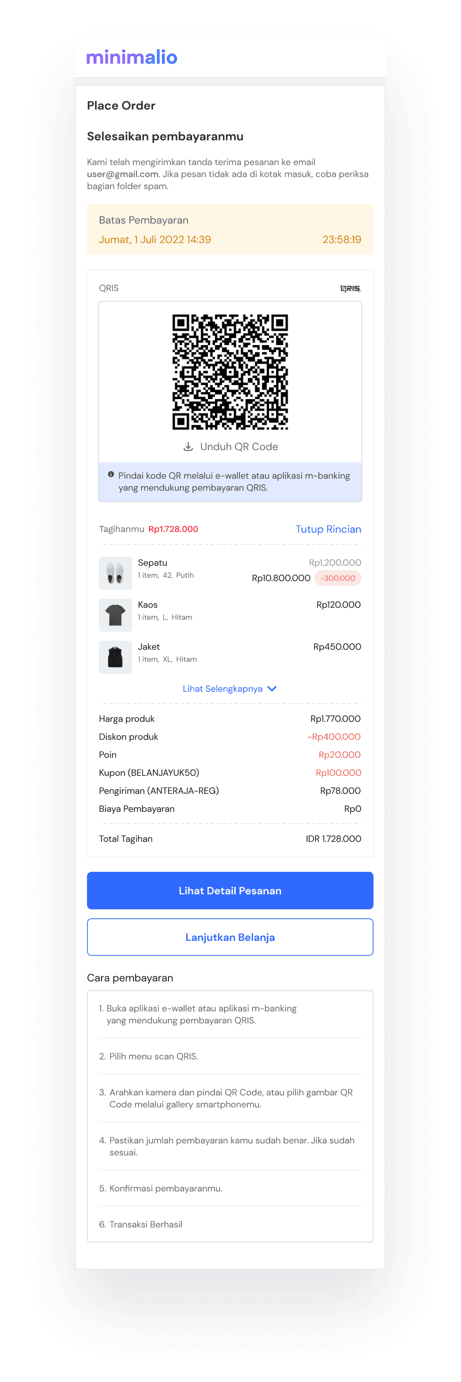
User make payment via QRIS:
Users can see the wording "We have sent an order receipt to email user@gmail.com. If the message isn't in your inbox, try checking the spam folder.”
Users can see the wording "We have sent an order receipt to email user@gmail.com. If the message isn't in your inbox, try checking the spam folder.”
Users can see the payment limit

User can download QR Code
Users can view billing details under QRIS

Users can select the "Check Payment Status" and "Continue Shopping" buttons
Users can see how to pay using QRIS
E-Wallet
User Stories
User make payment via E-Wallet (LinkAja):
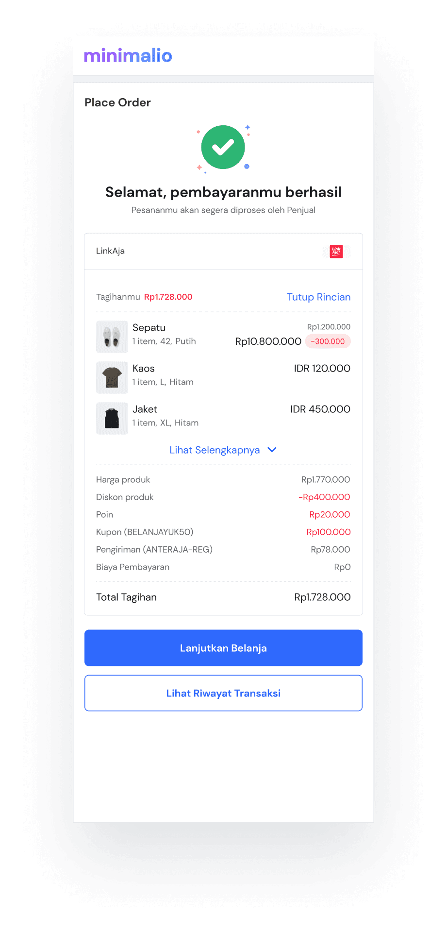
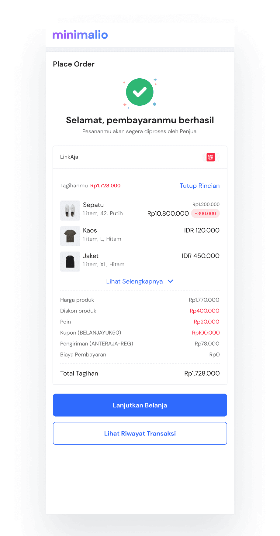
The user will enter LinkAja apps for payment, after successful a page will appear as shown on the left side
Users can view billing details under LinkAja
Users can select the "Check Payment Status" and "Continue Shopping" buttons
Virtual Account
User Stories
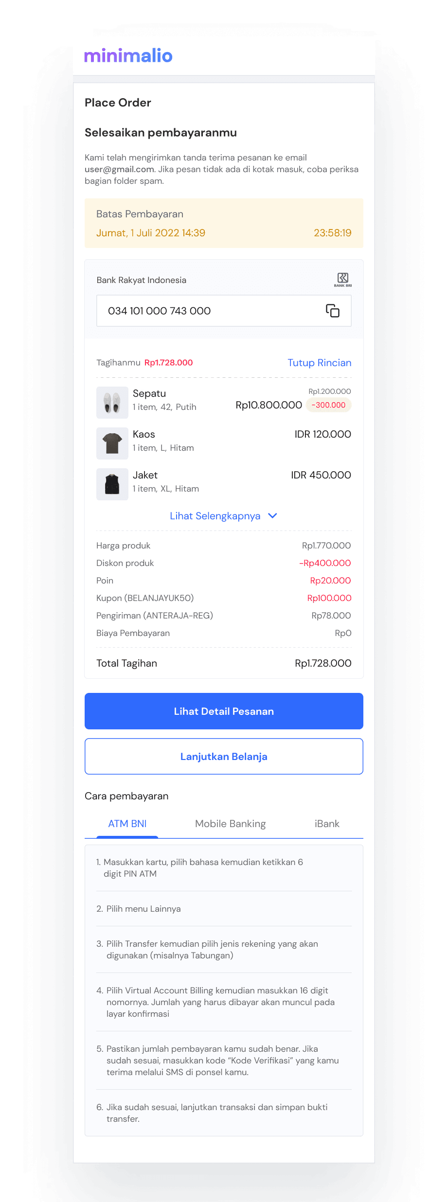
Users make payments through a Virtual Account
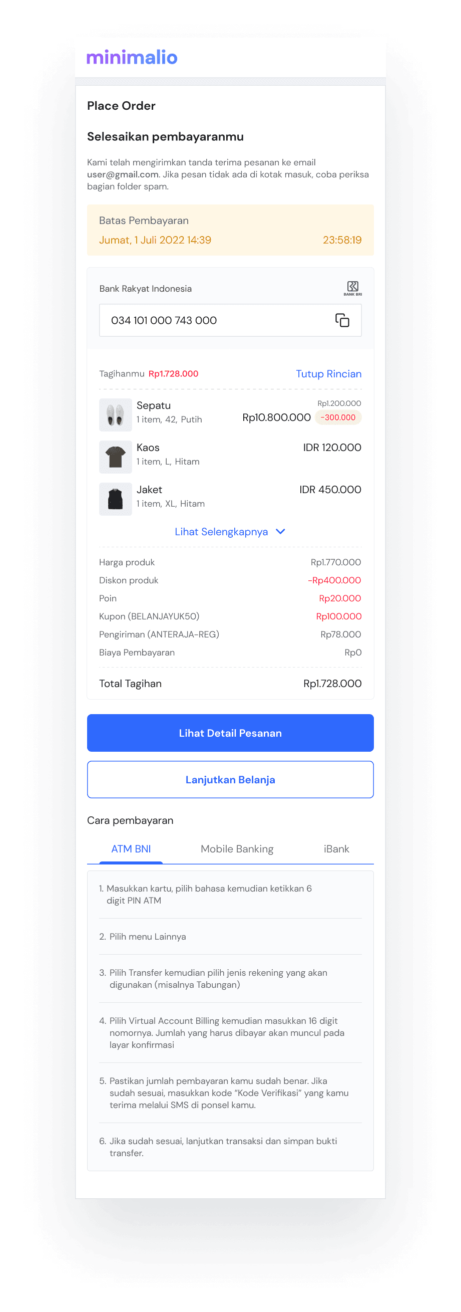
Users can see the wording "We have sent an order receipt to email user@gmail.com. If the message isn't in your inbox, try checking the spam folder.”
Users can see the payment limit
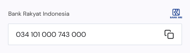
Users can copy account number
Users can view billing details
Users can select the "Check Payment Status" and "Continue Shopping" buttons
Users can see how to pay using Virtual Account
OTC (Over The Counter)
User Stories
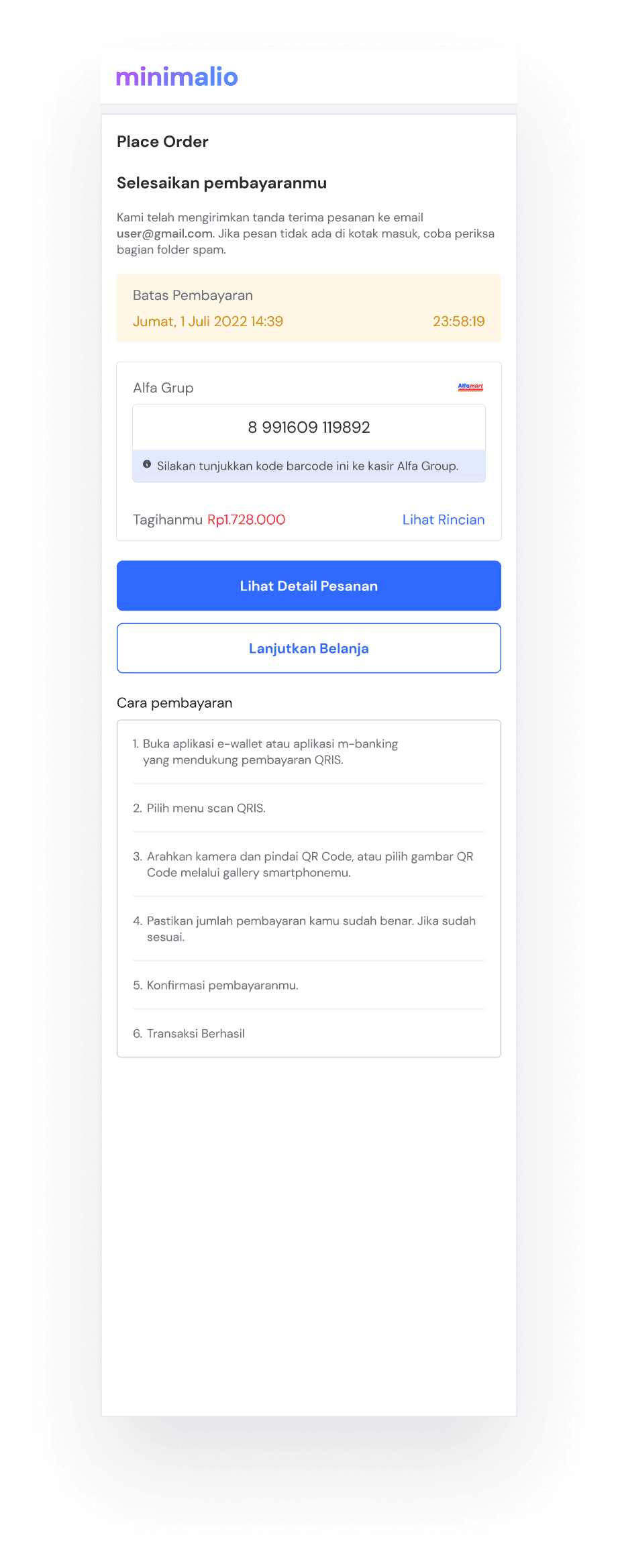
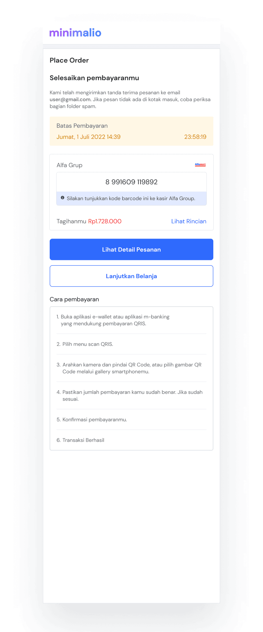
User make payment with OTC (Alfamart)
Users can see the wording "We have sent an order receipt to email user@gmail.com. If the message isn't in your inbox, try checking the spam folder.”
Users can see the payment limit
User can see barcode code
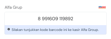
Users can view billing details
Users can select the "Check Payment Status" and "Continue Shopping" buttons
Users can see how to pay using OTC
COD (Cash on Delivery)
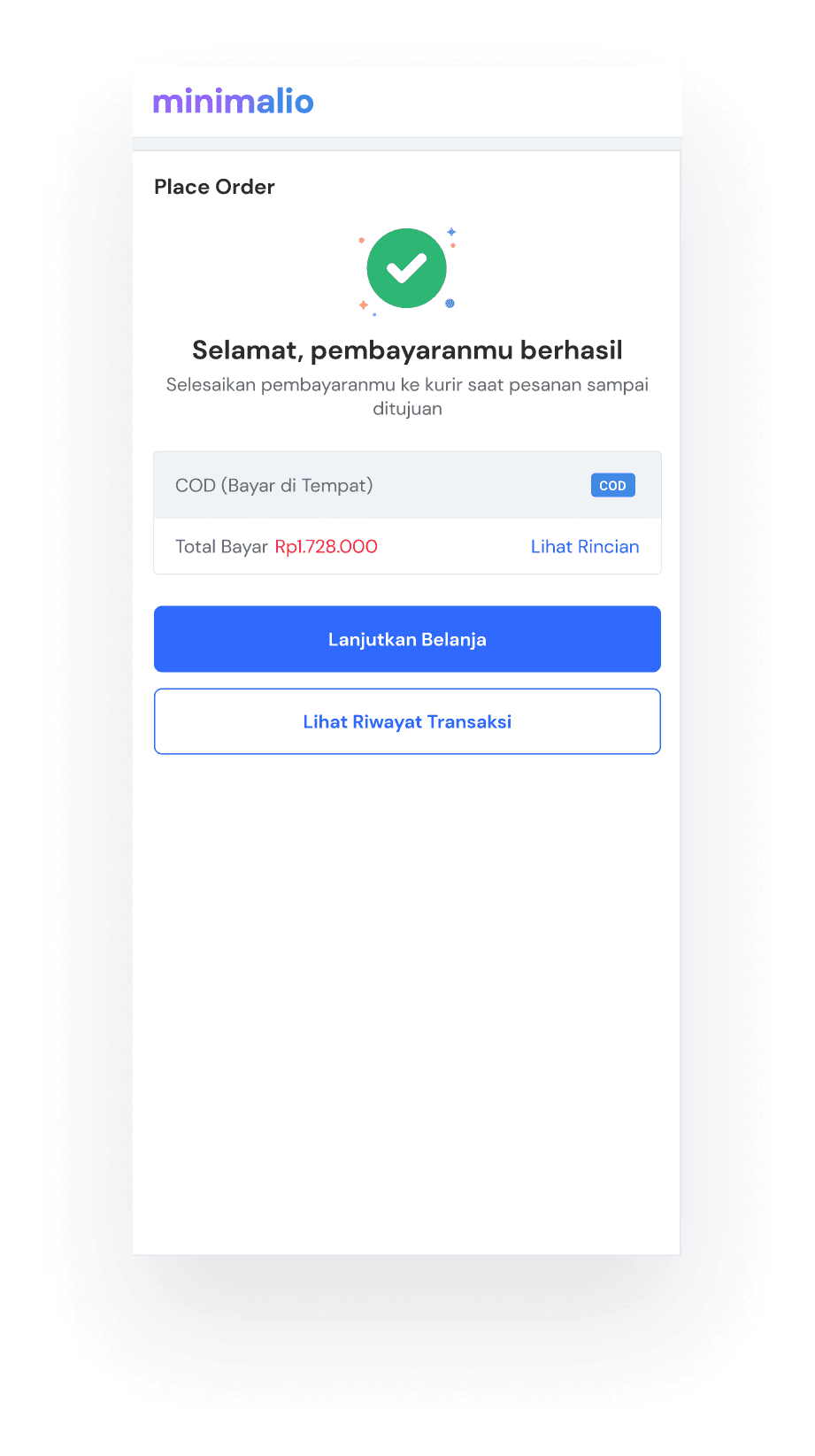
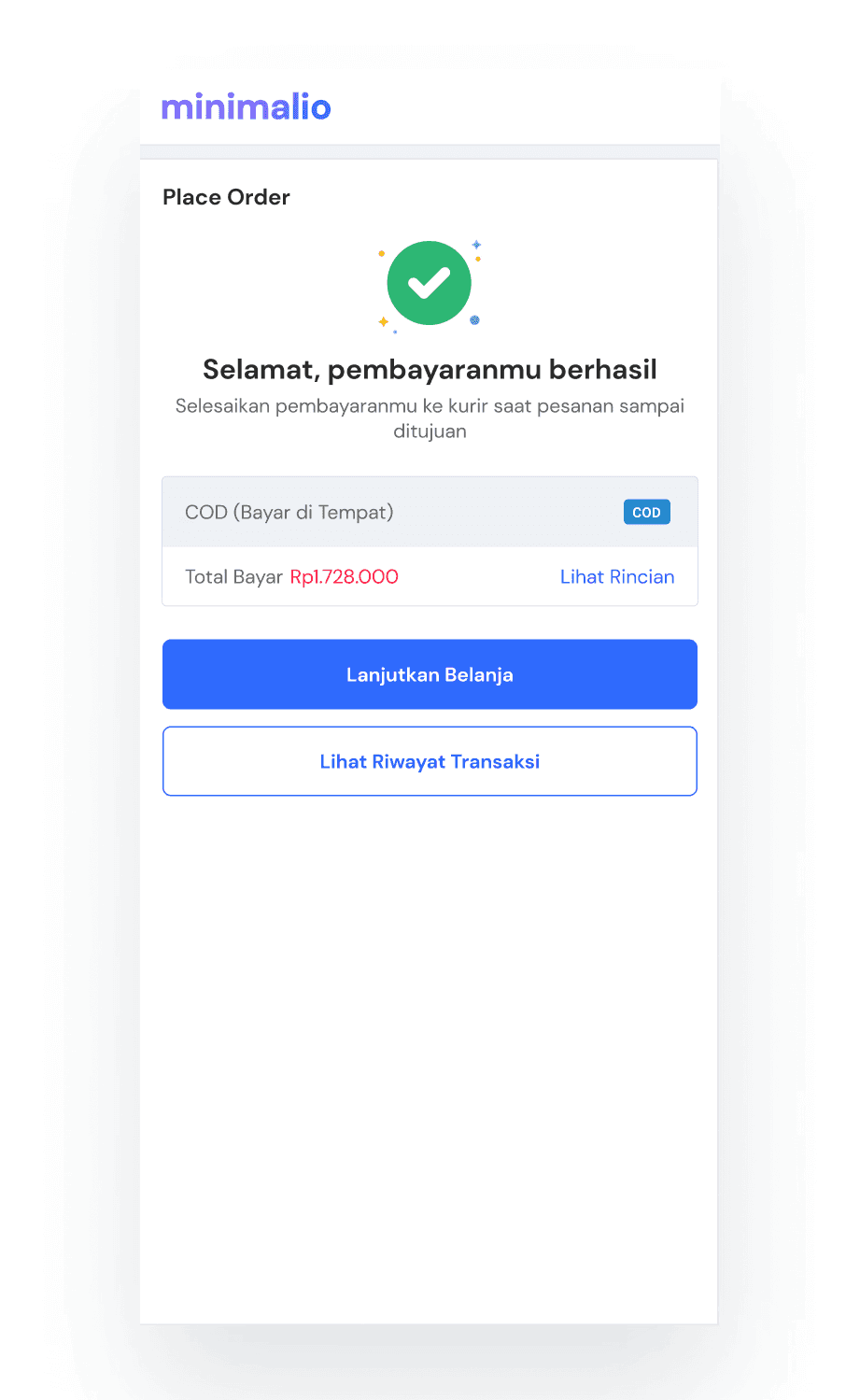
User Stories
User make payments with Cash on Delivery
Users can view billing details
Users can select the "Check Payment Status" and "Continue Shopping" buttons
💡Lesson Learned
This is the very first project that I work on in my Internship at SIRCLO. Since this project was implement in template I can I can play around with the visuals, because the UI that is made must adapt to the design characteristics of the existing template. It also very interesting because I finally work on a real project.
I learned a lot from this project about how to collaborate with designers and other stakeholder. For example with designers when we do a brainstorming and design review or with engineers when do a QA design from the design that have been made.
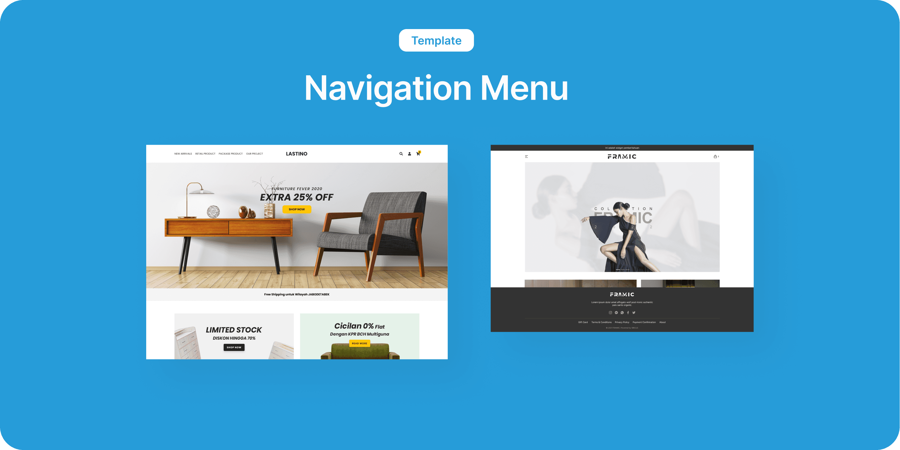
Template Navigation Menu
Background
For now the menu navigation display is still messy and causes the design to not match the existing templates and creates problems for merchants in managing the webstore appearance if the menu navigation exceeds the number specified in each template.
Project Goals
Helping merchants to add and tidy up the position of navigation menus when there are more than 5 menus on the desktop display so that they can display all the content or products they want to display to potential buyers and increase their store sales.
Problem Statement
“As a merchant, I need to tidy up the position of the navigation menu on the template that I use because the template that I'm currently using doesn't look neat and professional because the content or navigation menu that I have exceeds the amount predetermined based on the template I chose and besides that I want to make it easy for buyers to explore the content and products that I have.”
How Might We
💡
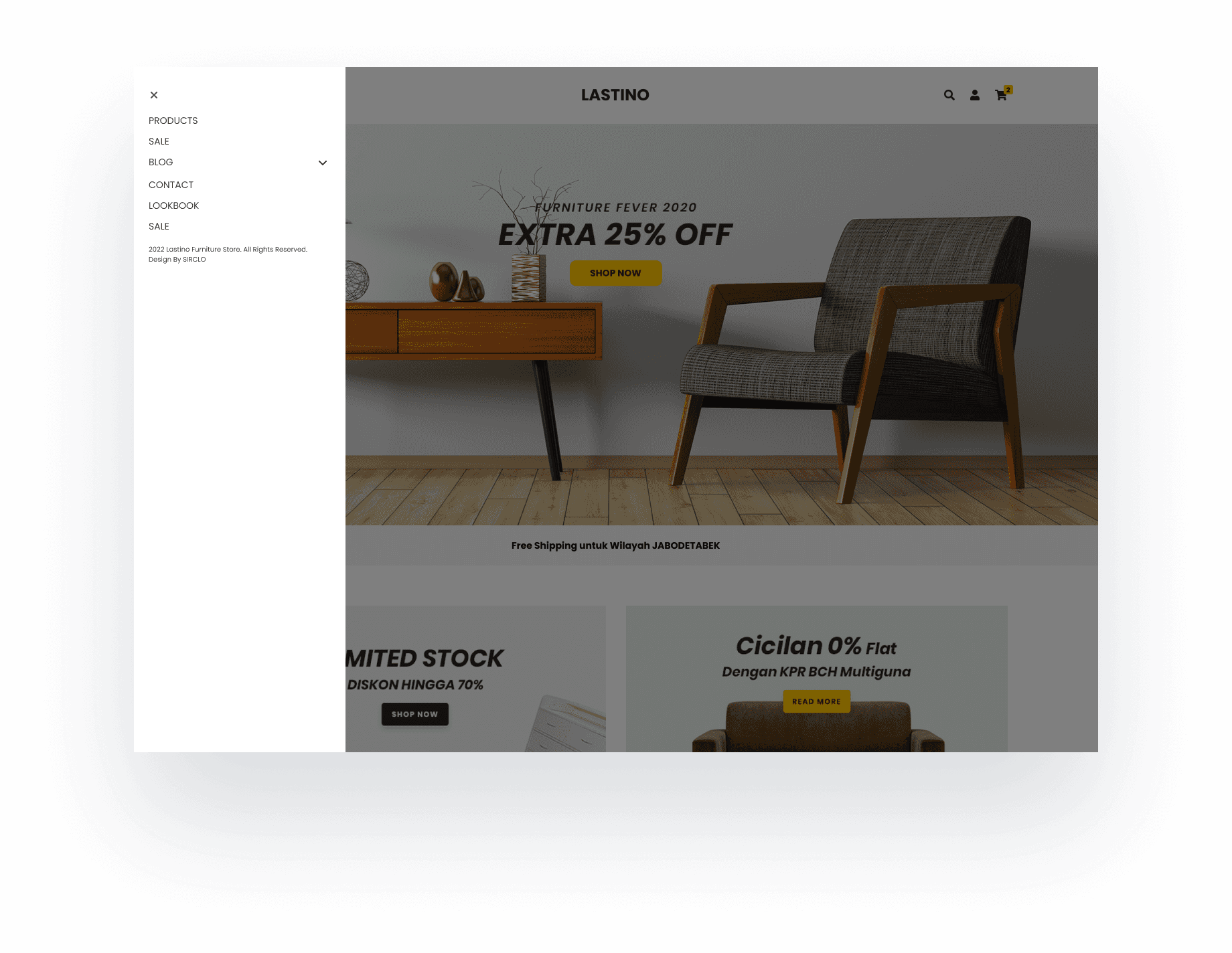
Added a hamburger menu on the desktop view
💡
Added info on (Merchant Dashboard) for the ideal number of navigation menus on some templates
Implementation
From the ideas that have been made, we started to implent it on several templates. The rules in several templates are different, following the navigation bar design in each template.
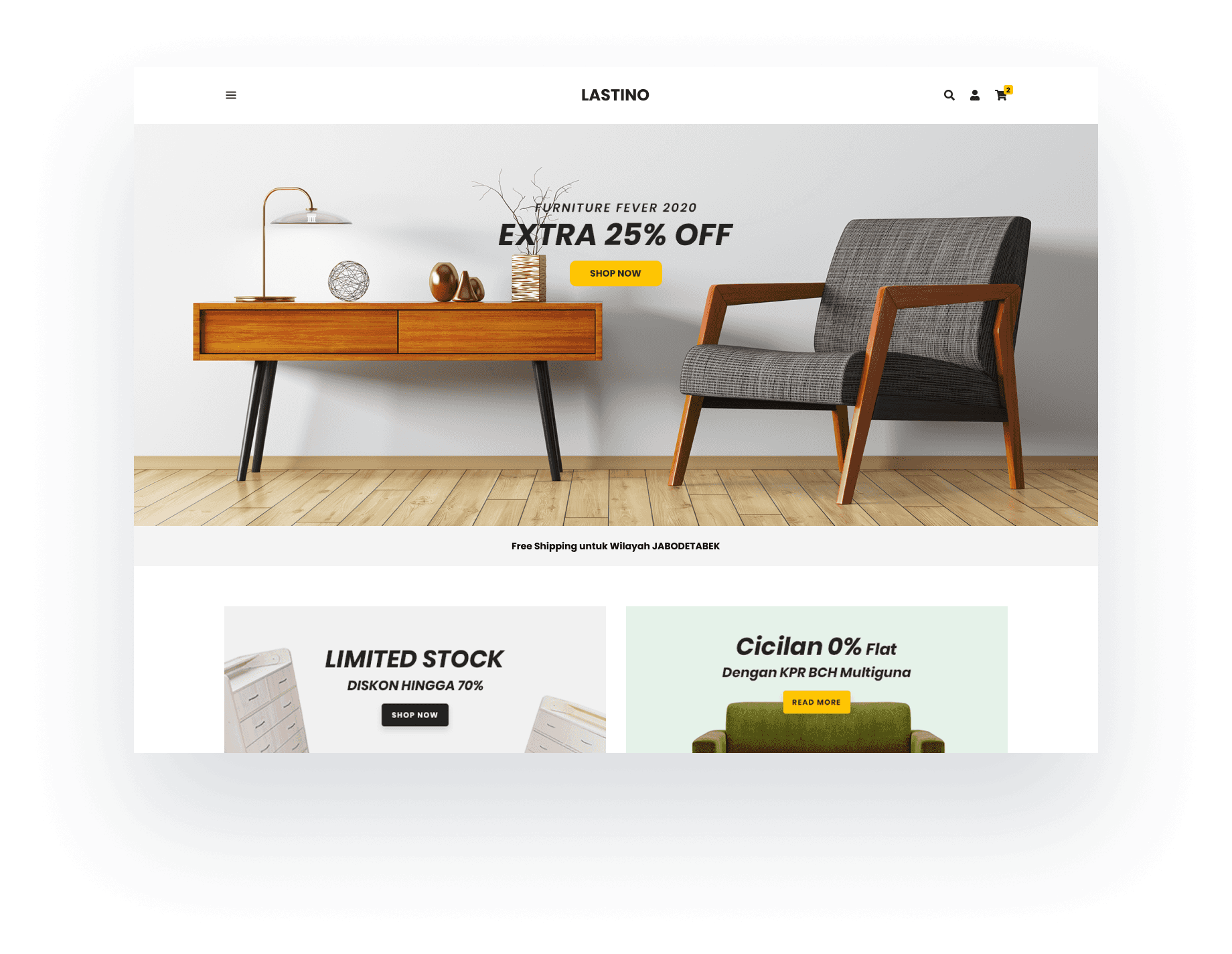
As an example for the Lastino template, the navigation bar is like this.

The menu in navigation bar is set for 5 menus, if we add let say 1 menu will look like this —

This makes the UI look not appropiate, so we decided to change to hamburger menu if the menu more than 5 menus. The navigation bar will look like this —
💡Lesson Learned
From this project I learned that always think about error cases that users might find if we design a product where users can put the content in it. Also in designing we cannot be idealistic, because there will always be limitations such as the technology itself